June 25
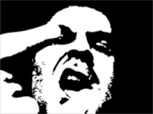
Tattoo design..
These were done for a friends wife.

I thought that, while a little too bold, the white around the "A" helped with separating the letter from the image.

However, the black does it too. As well as helping it look integrated into the image by making it appear beveled into the design.
Started in Illustrator and tweaked in Photoshop.
These were done for a friends wife.

I thought that, while a little too bold, the white around the "A" helped with separating the letter from the image.

However, the black does it too. As well as helping it look integrated into the image by making it appear beveled into the design.
Started in Illustrator and tweaked in Photoshop.


1 Comments:
Hey dude...she loved the design and loves her new tat.
Post a Comment
Subscribe to Post Comments [Atom]
<< Home